Literally terrible
So on brief – and so boring

I subscribe to Money Week and with every edition there’s a fresh crop of ads that look like this. Open any magazine and you’ll see something similar. These ads are produced to a lazy formula that can be best described as “stick a picture of the target audience in the ad and don’t waste time thinking about something more creative”.
Why this sucks
Ad briefs always include a description of the target audience. In recent times these have tended to become more embellished as planners use “consumer insight” to create “customer personas” – but there’s essentially nothing new about it. This gives the creative team, and client, a clear idea of who the ad is aimed at. It’s very useful. But it does not give you permission to literally put a picture of this hypothetical person in the ad. Producing a good ad, one that’s going to pass the AIDA test (grab attention, generate interest, stimulate desire, get someone to take action), requires a bit more thought and effort.
Well prepared ad briefs contain a proposition, a promise that the reader will find interesting. A good creative team will focus on this promise then find a way of expressing it in the most remarkable way possible. This is where the work and skill come in. The promise is probably not that unique or novel – usually there will be many competitors offering essentially the same thing. The copywriter and art director/designer must use their imagination to express the offer in a way that is motivating (passes the AIDA test) and makes the offer/brand appear quite different from that of competitors.
Lateral vs literal
The way a good creative team does this is by being lateral, rather than literal. For example: 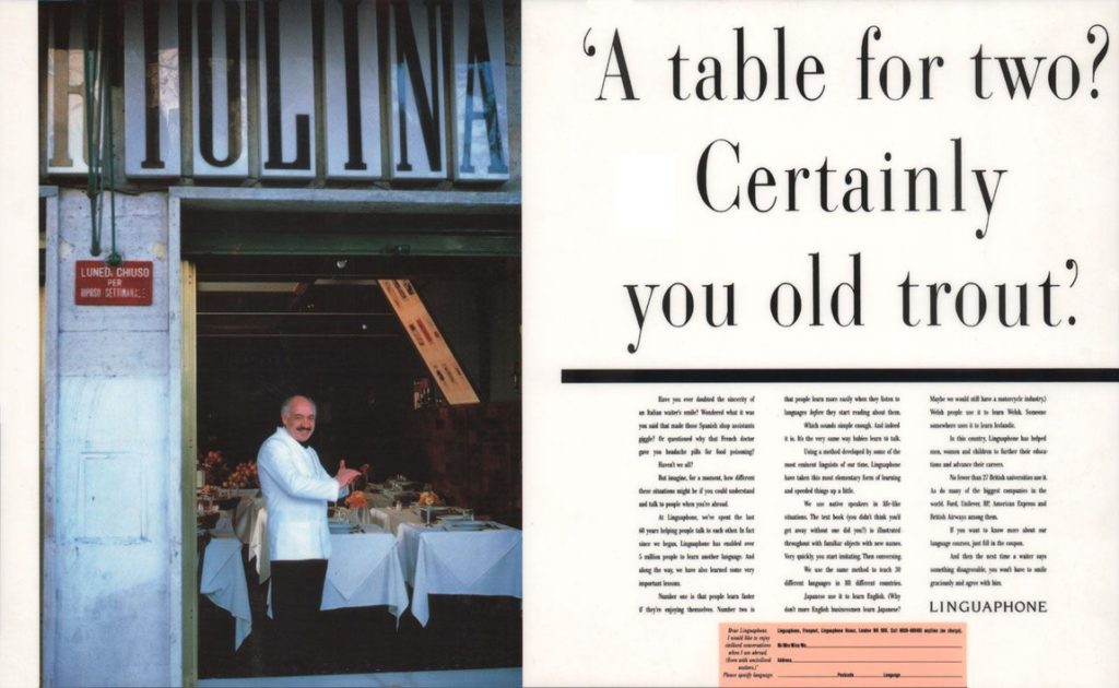 This ad for language learning course Linguaphone doesn’t have a corny picture of a young man in Italy chatting up local girls with a “The quickest and easiest way to learn a new language” headline. That would be a literal interpretation of the brief. This ad flips it around so you see, through the eyes of the target audience, an Italian waiter who has spotted a non-Italian speaking couple he can rip off and take the piss out of. It’s surprising, powerful, funny and makes Linguaphone appear very different from other language course providers.
The first ad I featured above, for AJ Bell, literally follows the brief and just sticks the target audience persona in the ad. I bet the brief has a line in it describing the target audience as “The Eary Bird Investor”. So the lazy creatives just stick that title in as well. Realising this is actually as boring as **** they find a stock image of someone whose face is obscured by a cup. How edgy and intriguing is that?!
The copy also reads like a creative brief: “we want to target women aged 25-35 who would like to discover their inner investor”. How many women of that age do you actually hear spouting such crap? It’s marketing-speak and you may use it in meetings…but don’t put it in the ad! So, it’s literal, not lateral.
Curate vs create
How did this woman-with-cuppa ad end up running (week after week!)? The designer (I doubt a copywriter was involved) took the quickest, easiest and safest route possible. Copy and paste brief into ad, download image that represents persona, then head off for lunch in trendy wine bar and meet all the other designers who have been “busy, busy, busy” turning out the same lazy dross. In the afternoon the client team sign it off because it is “so totally on brief” then go to Caffe Gusto/boxercise class/tapas bar to tell their mates about the genius new “creative” they’ve “ideated”.
The fact the ad looks like so many other financial ads does not bother them. In fact it seems to reassure them. The “curation” mentality so prevalent at the moment gives people the idea that copying what everyone else is doing is good. Doing something different is hard work and risky…better stick with the crowd.
Copy and paste
Here’s an ad for one of AJ Bell’s competitors, running in the same edition of Money Week. It looks so similar that I had to check that the two companies are co-owned (they’re not). 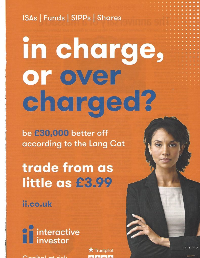 This ad is better in that it does have a decent headline and some pretty compelling benefits/sales points. By why make it look identical to a competitor ad? Two brands/creatives/marketing teams curating each other’s looks while on auto pilot. Here’s another ad from same mag:
 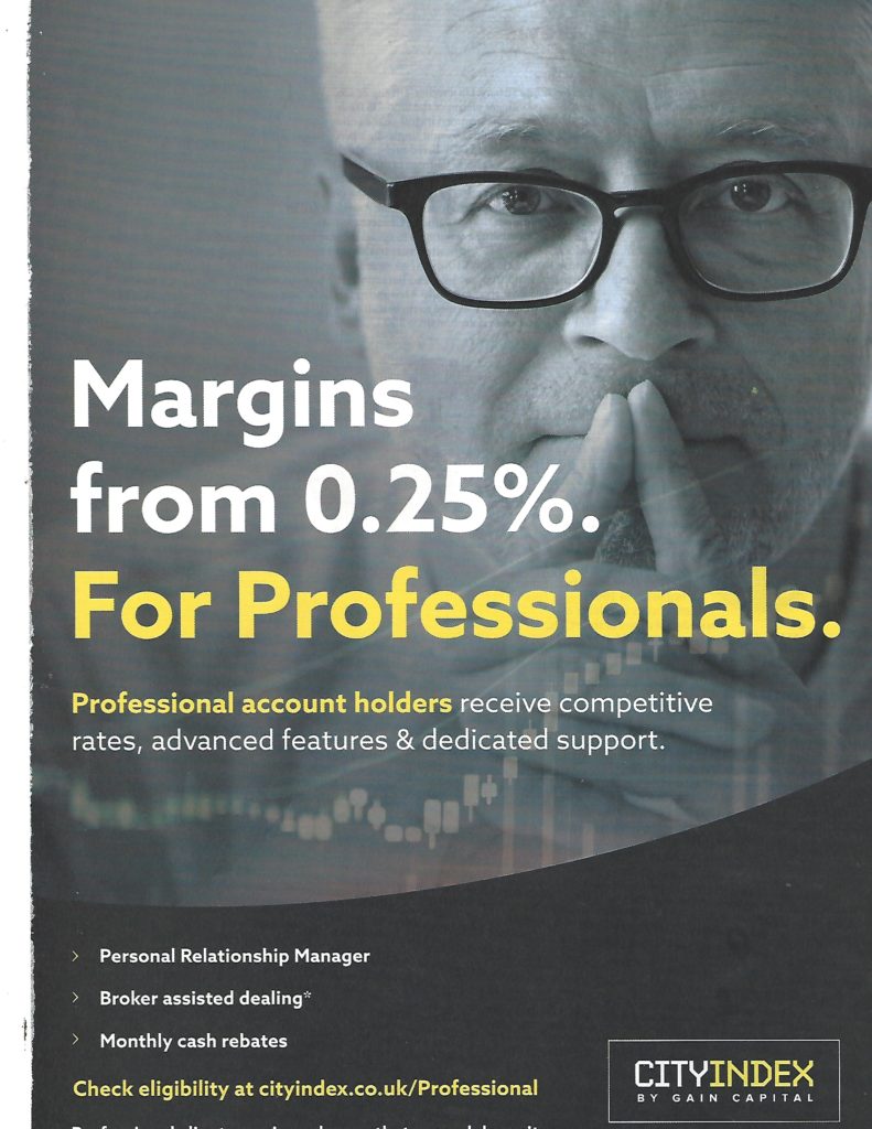 Image of target audience persona (The Professional), with a headline that says “For Professionals”. They’ve literally reproduced what’s in the brief. And assumed “professionals” will relate to it because “hey, a picture of someone who is supposed to be me…I’d better read this!”. If only professional traders were so dumb and easily influenced. What were the people at CITYINDEX thinking when they ran this ad? They weren’t.
MBA – Most Boring Ads?
This rash of lazy, literal and utterly bland ads is not merely infecting the financial services industry. It’s a virus that has afflicted the entire marketing industry – you see examples in every sector from consumer products to professional services. There is one area, however, where this particular outbreak of derivative mediocrity is especially virulent – business schools. 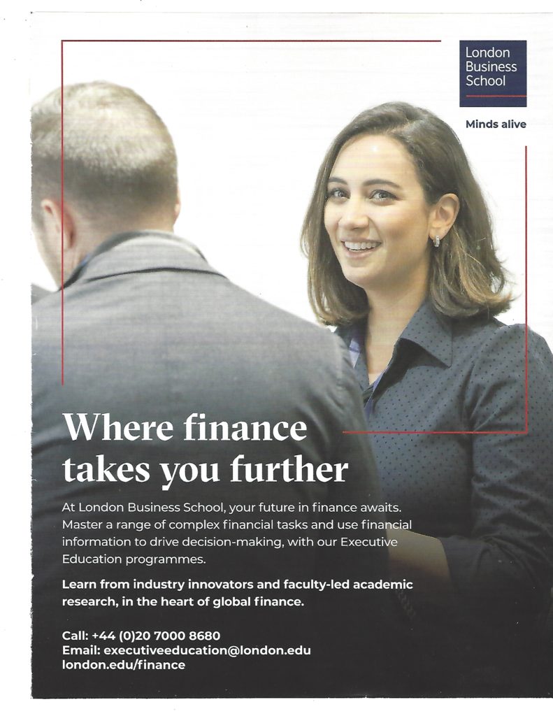 A grey ad in every sense. Dull picture and trite text. It’s so generic you could take that text and plonk it on any one of a hundred business school ads without a problem. Their strapline is ‘Minds alive’ Not much evidence of that judging by this semi-comatose effort.
 Headline with two tired buzzwords. Racially inclusive image with positive female bias – tick. Information, nil. Could be University of Anywhere. Ad suggests an institution that’s conservative and hidebound rather than thrusting and innovative – on this evidence change is the last thing they are going to create.

Copy and paste bullet points from the brief, stick them in a speech bubble so they look like a real person said them (really?!) then find an inclusive (gender and race, tick) image of people loving their lecture. Job done, high fives all round. 
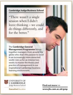
Headline is basically just the title of the course with the word “Think” in front of it. Ironic, because this ad shows no evidence of thought whatsoever. OK, there’s an image of someone vaguely executive-looking who is actually thinking but that merely underlines the lack of imagination and effort that has gone into this.
Yawn. Utterly generic and bland, saying exactly the same things, in the same way, as a hundred other business schools. And the guy looks so…inspired!

Ditto. But a real person, so that’s more authentic, right? But it’s still just a jumble of buzzwords (‘impact’, tick) and phrases lifted straight from the brief (“gave me a great learning experience”…she really said that?).
Must try harder
I’ve picked ads, on purpose, from some of the worlds’ most prestigious business schools. And they are all crap. The target audience is highly educated people with intelligence to spare. But these ads treat them like Pavlov’s dog. What kind of arrogant prick thinks you can just show a picture of someone who looks a bit like them, then chuck in a bit of academic management-speak, and they’ll all sit up and beg? Famous adman Bob Levenson remarked that “No wonder most intelligent people ignore advertising. Most advertising ignores intelligent people.” So true.
The bland leading the bland
It’s clear that the top institutions moulding the world’s managers and business leaders simply do not understand how advertising and the art of persuasion work. They have not one shred of imagination or respect for creativity. The idea that they should make some effort to differentiate their school from all the others, or do something that actually gets noticed, seems to scare them. That’s why we get so many of these boring as hell cookie-cutter ads produced by rote.
Even more scary is the fact that these academics are churning out managers and business leaders in their own image – corporate clones with zero emotional intelligence and a dangerous sense of their own superiority.
If only the rot were confined to those clinging to the greasy pole atop ivory towers. Much of the marketing industry, sadly, seems to be suffering from the same malaise. Lateral thinking, imagination and wit have been replaced by lazy ads that literally regurgitate whatever is on the brief. “Creative” has become anything but.
Who's the Sheriff?
 GOOD AD, BAD AD, UGLY AD is written by saddle sore copywriter Jim O’Connor.
Recent Comments